
Actionable cloud cost recommendations
Virtana Cloud Cost Management
The brief: rewrite and redesign
Virtana needed to migrate cloud cost management capabilities from an acquired legacy platform to a new platform.
As the UX leader, I wanted to leverage this opportunity to improve the user experience so that existing customers were motivated to shift to the new product.
The challenge: customers can't find the value
The legacy product provided cloud cost savings recommendations but customers struggled to find the recommendations or act on them. This was an existential issue for the product because, as a key capability, recommendations are meaningless if they do not result in meaningful change.
What I did: led a design sprint
DESIGN SPRINT FACILITATION
I recognized the need for speed and organized and facilitated a week-long remote design sprint to align a cross-functional team on customer needs, prototype a solution and test it with customers. The sprint got us much closer to a solution, but we learned we had more work to do.
DESIGN LEADERSHIP
I led the design team through iterations to get to a implementable solution that met customer needs.
COMMUNICATION & DELIVERY
I also worked closely with product management and engineering to communicate and articulate the vision and new approach.
Key tools and methods
Miro
Figma
Workshop facilitation
Customer interviews & usability testing
Wireframes and prototypes
Outcome
Virtana migrated the capabilities to the new platform within a year and successfully migrated all existing customers. The new product was the heart of a “Radical Simplicity” marketing campaign.

RESULTS IN QUOTES

A Customer
This is really easy.

A Partner
This is what I've been asking for.

An Analyst
It's a really nice interface, whoever designed this did a really good job.

How we got there
Since customers often struggled to reduce costs with the original product, we decided to focus on ensuring customers could find and act on our cost savings recommendations.
Where we started
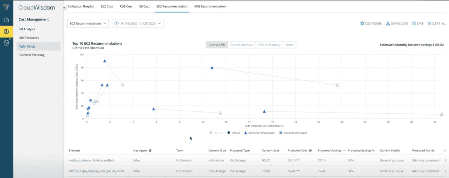
The original UI required users to find and run separate reports to get recommendations. It had complex visualizations that did not increase trust and did not provide a way to easily take action.

Mapping the journey
I led the mapping out the customer journey. Our customer success and support teams helped us understand the problem: customers struggled to act on recommendations because they needed approval from application owners to make changes.

Solution sketches
Each participant sketched a solution. The product manager picked elements from three sketches: a dashboard, a guided order of operations and policies to ensure recommendations met application needs.
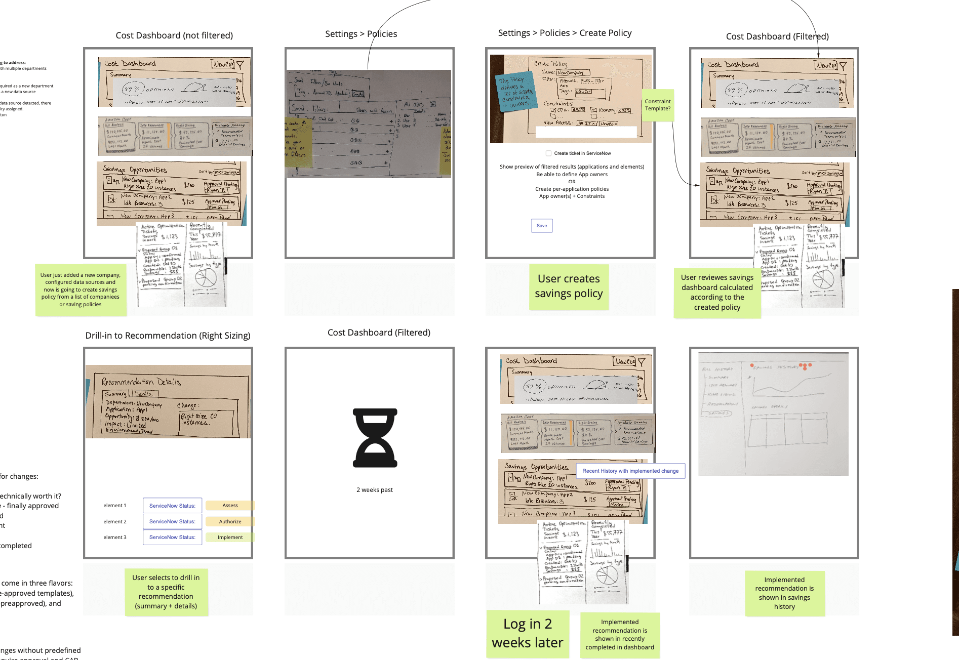
Storyboard
We storyboarded the journey customers would take from realizing they could cut cloud costs, to implementing the recommendation, and finally seeing the impact of changes.
Prototype
The prototype was built by two of the designers on my team based on a storyboard we put together as a group.

User interviews
Customers interviewed thought the prototype was better than the current product, but there was room for improvement. They liked the dashboard and connection to change management tools, but found the flow and complexity confusing.
Radical Simplicity
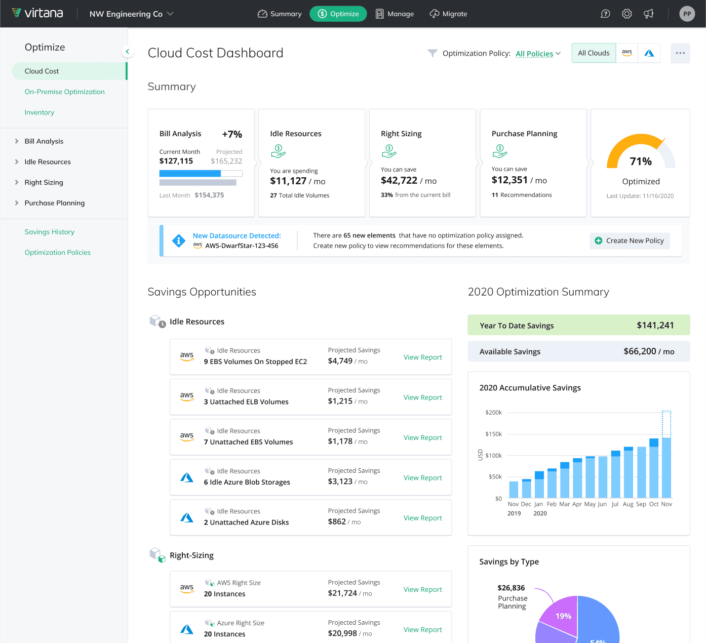
In the end, we took what we learned in the design sprint and simplified the design by removing the need for separate reports. Instead, we listed all recommendations on the main page, using policies to ensure each recommendation was tuned to application needs.

Other Case Studies

Self-Service Onboarding
(PLG)
Lessons in product-led growth and increasing the number of successful activations.
Read Case Study
Visualizing Network Fabric Topologies at Scale
A patented information visualization design for Cisco's Data Center Network Manager.
Read Case Study
Interested in learning more?
Contact me at kora@korabongen.com